
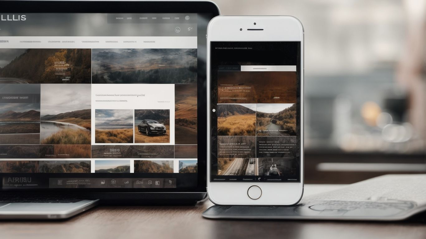
In today’s digital age, a user-friendly website is essential for attracting and retaining visitors. One key element of a user-friendly website is its navigation.
But what exactly is website navigation, and why is it so important? In this article, we will explore the ins and outs of website navigation, including tips for creating a user-friendly navigation system, common mistakes to avoid, and how to test and improve your website’s navigation. Whether you’re a web designer, business owner, or simply interested in improving your online presence, this article will provide valuable insights to help you optimize your website’s navigation.
What Is Website Navigation?
Website navigation refers to the process of creating a user-friendly interface that allows users to efficiently and effectively interact with a website, enhancing their overall experience and usability.
Website navigation plays a crucial role in guiding visitors to find the information they are looking for. It facilitates smooth transitions between different sections and enables seamless access to the website’s features.
A well-thought-out navigation system enhances the overall design and ensures that users can easily locate the content they desire. This leads to increased engagement and longer session durations. By incorporating intuitive menus, clear labels, and logical structures, website navigation contributes to a positive user experience and fosters a sense of satisfaction and ease of use.
Why Is User-Friendly Website Navigation Important?
User-friendly website navigation is crucial for ensuring an intuitive, accessible, and efficient user experience, enabling visitors to easily navigate through the content and interact with the website effectively.
User-friendly navigation plays a pivotal role in shaping users’ perception and engagement with a website. It achieves this by offering clear labels, logical menu structures, and easy access to essential information. This promotes seamless exploration and enhances user satisfaction, resulting in lower bounce rates and increased user retention.
Moreover, intuitive navigation fosters a positive brand image and encourages users to return, ultimately contributing to the website’s overall success and performance.
How to Create User-Friendly Website Navigation?
Creating user-friendly website navigation involves implementing best practices in web development and design, including clear labels, organized categories, and a responsive, mobile-friendly interface to optimize user engagement and usability.
By ensuring that the labels accurately represent the content they lead to and that the categories are logically structured, users can easily find the information they are looking for.
Seamless integration of navigation elements across different devices is essential for a positive user experience, making mobile optimization a crucial aspect.
Consistency in design and user interface elements also contributes to intuitive navigation, allowing users to effortlessly move through the website and find what they need with minimal effort.
Use Clear and Descriptive Labels
Clear and descriptive labels play a pivotal role in enhancing the user-friendliness of website navigation, ensuring simplicity, organization, and easy categorization of content for seamless user interaction.
When users visit a website, they rely on labels to guide them through the various sections and pages. Well-crafted labels help users quickly locate the information they are seeking, reducing frustration and making the overall browsing experience more enjoyable.
By using clear and descriptive labels, website owners can improve the usability of their site, leading to higher visitor retention and engagement. These labels also aid in content organization, making it easier for users to find relevant material and navigate through the site effortlessly.
Keep Navigation Consistent
Consistency in navigation design is essential for providing a cohesive and predictable user interface, fostering a seamless user experience and interaction that aligns with user behavior and expectations.
Optimizing readability and SEO involves breaking paragraphs into concise, easily digestible sentences. This approach enhances user experience and search engine indexing.
By maintaining a consistent layout and structure, users can easily find and access the information they need, reducing frustration and enhancing their overall satisfaction with the website. This can also boost engagement and encourage further exploration of the site, potentially leading to higher conversion rates.
Consistent navigation is crucial in reinforcing brand identity and establishing trust and reliability with users. It allows for easy navigation through different pages, making it easier for users to find what they are looking for.
Utilize Drop-Down Menus
The use of drop-down menus enhances the interactive nature of website navigation, allowing for intuitive and user-friendly exploration of content, aligning with best practices in navigation design and usability testing.
Drop-down menus offer a hierarchical structure, allowing visitors to easily access specific sections of a website. This reduces the time it takes to find relevant information and promotes efficient user interaction.
Users can quickly locate and select their desired options from a compact menu, making drop-down menus a convenient form of navigation design. Additionally, they contribute to a clutter-free interface, improving the overall user experience and maintaining a visually appealing and easy-to-navigate website.
Use Bread Crumbs
Implementing bread crumbs in website navigation provides users with a hierarchical trail of their location within the site’s structure, enhancing the user-friendly and intuitive nature of the navigation experience, while improving overall user experience.
This hierarchical trail not only helps users understand where they are within the website but also allows them to backtrack easily, making navigation more seamless and efficient.
By integrating bread crumbs, websites can enhance the visual hierarchy, making it easier for users to comprehend the site’s structure and find their way around. This, in turn, positively impacts user engagement, as it allows visitors to navigate with ease, ultimately improving the overall site experience.
Incorporating bread crumbs can also complement sitemaps, providing users with multiple pathways to explore the website’s content.
Incorporate Search Functionality
Incorporating search functionality enriches the user-friendly nature of website navigation, enhancing accessibility, user engagement, and satisfaction by providing a seamless and efficient search experience for visitors.
Integrating search functionality on a website allows users to easily find specific products, services, or information they are looking for, resulting in a better overall user experience. This can lead to increased time spent on the site and a higher likelihood of converting into customers. A well-implemented search feature also contributes to a positive perception of the website’s usability, encouraging repeat visits and building brand loyalty.
Consider Mobile Navigation
Considering mobile navigation is essential for creating a responsive and mobile-friendly user interface. It ensures a seamless experience that aligns with user flow and optimizes accessibility across various devices.
This emphasis on mobile optimization is in response to the increasing number of users accessing websites through their smartphones and tablets.
A responsive and mobile-friendly interface not only improves user experience but also boosts search engine rankings. This contributes to overall website performance.
Optimizing website navigation for mobile devices involves simplifying menus, using clear calls-to-action, and ensuring fast load times.
These elements play a crucial role in creating a smooth and efficient user journey. This ultimately leads to higher engagement and conversion rates.
What Are the Common Mistakes to Avoid in Website Navigation?
Understanding and avoiding common mistakes in website navigation is crucial for ensuring a seamless user interface and user experience, aligning with user behavior and the results of user testing to enhance overall usability.
Web developers can improve user satisfaction and decrease bounce rates by identifying and fixing navigation errors. By creating an intuitive and user-friendly interface, users are more likely to engage with the website’s content. This not only enhances the website’s aesthetics but also impacts user behavior. Conducting user testing can reveal the effects of navigation design, emphasizing the need to continuously refine and optimize navigation features to align with user expectations and preferences.
Using Ambiguous Labels
The usage of ambiguous labels in website navigation can lead to confusion and hinder user satisfaction, stressing the importance of clarity and precision to enhance usability and user satisfaction.
This issue can result in users feeling frustrated and disoriented when attempting to navigate a website, ultimately impacting their overall experience and satisfaction.
Clear and precise labels not only guide users seamlessly through the site, but also contribute to a user-friendly design, making the browsing experience intuitive and efficient.
By prioritizing clarity in navigation, website owners can significantly boost user satisfaction, ultimately leading to higher engagement and success for their online platform.
Having Too Many Navigation Options
Overloading a website with too many navigation options can overwhelm users and compromise the simplicity and efficiency of the navigation process, impacting user engagement and overall user-friendliness.
This cluttered approach can lead to confusion and frustration for visitors, hindering their ability to find relevant content or complete desired actions. Studies have shown that an excessive number of choices can result in decision fatigue, causing users to abandon the site altogether.
By streamlining the navigation and focusing on key pathways, the user experience can be optimized for clarity and ease of use, ultimately contributing to higher levels of engagement and satisfaction.
Hiding Important Pages
Concealing important pages within the website navigation can impede accessibility, diminish user retention, and disrupt the natural user flow, underscoring the significance of transparent and accessible navigation.
When users encounter obstacles in finding crucial information, it can lead to frustration and a higher likelihood of abandoning the website. With transparent and accessible navigation, users are more likely to stay engaged and explore further, positively impacting the overall user experience.
Hiding essential pages may also affect search engine optimization, as search engine crawlers rely on clear navigation to index and rank web pages effectively. Therefore, maintaining transparency in website navigation is crucial for enhancing user flow and accessibility.
Neglecting to Update Navigation
Neglecting to update website navigation can hinder its relevance, efficiency, and alignment with evolving user behavior. This stresses the importance of regular updates to maintain a user-friendly and pertinent navigation system.
This is particularly critical given the rapid evolution of user preferences and technological advancements. Users expect seamless and intuitive experiences, meaning that outdated navigation systems can lead to frustration and decreased engagement.
By incorporating system updates and responsive design principles, websites can adapt to changing user needs and ensure that visitors can effortlessly find the content they seek. User-friendly design elements, such as clear menus and intuitive search functionalities, are essential components that necessitate consistent attention and enhancement to optimize the user experience.
How Can You Test and Improve Your Website Navigation?
Testing and improving website navigation involves leveraging user testing, website analytics, and user feedback to enhance the user experience, engagement, and overall effectiveness of the navigation design.
By implementing user testing, website analytics, and collecting feedback directly from users, businesses gain valuable insights into how users interact with their websites.
User testing allows for the observation of real user behavior, while analytics provide quantitative data on user pathways and interactions.
User feedback, gathered through surveys, interviews, or feedback forms, offers qualitative insights into user preferences and pain points.
With this comprehensive approach, website navigation can be refined to meet the needs and expectations of the target audience, ultimately driving improved user satisfaction and engagement.
Conduct User Testing
Conducting user testing for website navigation is essential for gaining insights into user experience, satisfaction, and behavior. This provides valuable data to inform and enhance the effectiveness of navigation design.
User testing allows designers and developers to observe user interactions and identify potential challenges or confusion. With real-time feedback, informed adjustments can be made to prioritize user-friendly design. This leads to a seamless and intuitive navigation experience, increasing user satisfaction and understanding of user behavior.
Ultimately, effective user testing ensures that the website’s navigation meets the needs and expectations of its users.
Analyze Website Analytics
Analyzing website analytics offers valuable insights into navigation effectiveness, user engagement, and flow, empowering data-driven decisions to optimize the navigation experience and user interaction.
This comprehensive analysis helps businesses understand how users navigate through their websites, identifying potential bottlenecks, popular pathways, and areas for improvement.
By tracking user behavior and interactions, organizations can tailor their websites to enhance the user experience, ultimately leading to increased engagement, conversions, and customer satisfaction.
Leveraging website analytics for navigation analysis enables businesses to refine their strategies, prioritize content, and make informed decisions based on data-backed insights, ultimately driving better results and the success of their online presence.
Get Feedback from Users
Seeking feedback from users regarding website navigation is instrumental in identifying areas for improvement, enhancing the user experience, and fostering effective interaction between visitors and the navigation system.
By understanding user perspectives, website owners can make informed decisions to create a more intuitive and user-friendly design. This not only leads to smoother navigation but also helps in addressing any pain points, ensuring a seamless browsing experience.
User feedback can serve as a valuable source for implementing enhancements, optimizing page layout, and refining search functionalities, thereby resulting in a more engaging and gratifying interaction for visitors.
Frequently Asked Questions
What are some tips for creating a user-friendly website navigation?
1. Keep it simple and intuitive: Avoid clutter and make sure the navigation is easy to understand and use. Use clear and concise labels for each button or link.
Why is it important to have a user-friendly website navigation?
2. Improved user experience: A user-friendly navigation makes it easier for visitors to find what they are looking for, leading to a better overall experience on your website.
What elements should be included in a user-friendly website navigation?
3. Consistent design: Use the same design and layout for all pages to maintain consistency and familiarity for users.
4. Search function: Include a search bar to allow users to quickly find specific content on your website.
How can I make my website navigation mobile-friendly?
5. Use a responsive design: Make sure your website is optimized for mobile devices by using a responsive design that adjusts to different screen sizes.
6. Use a hamburger menu: Consider using a hamburger menu for mobile users, as it takes up less space and can be expanded to show the full navigation menu.